Brand Identity
Brand Identity
Brand Identity
Refresh Kits
Refresh Kits
Refresh Kits


Overview
Overview
Overview
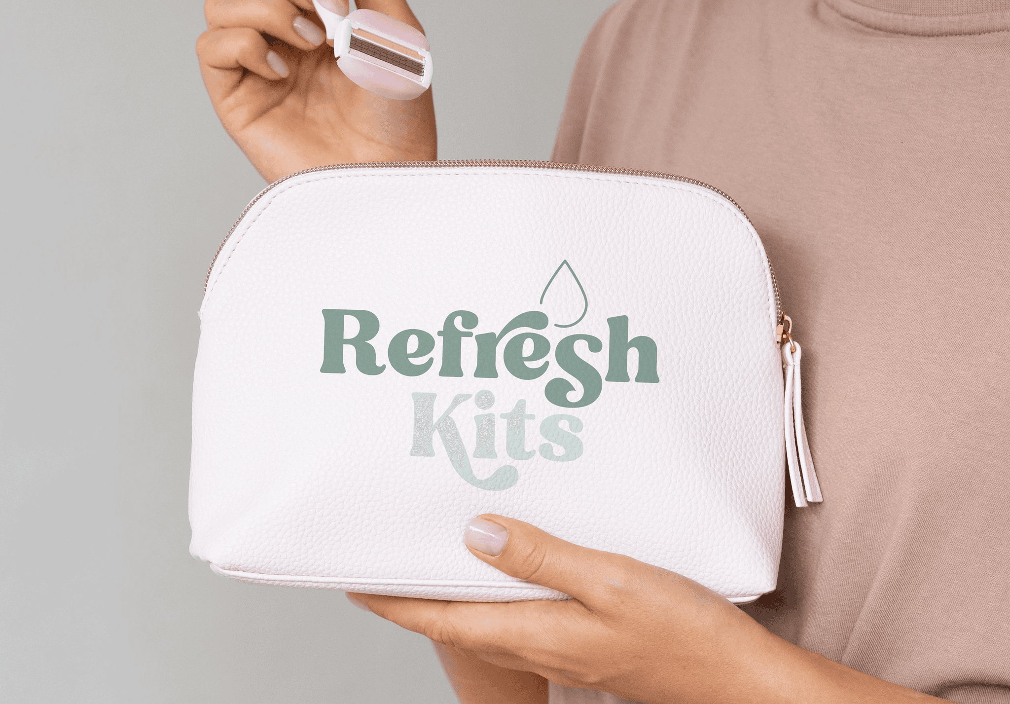
Refresh Kits are a force for good with their
mission to help young people with accessing the essentials they need. They hand out their kits
for free in schools for those in need, to promote
good hygiene and reduce stigma before and
throughout the teenage years.
Refresh Kits are a force for good with their mission to help young people with accessing
the essentials they need. They hand out their kits for free in schools for those in need, to promote good hygiene and reduce stigma before and throughout the teenage years.
Refresh Kits are a force for good with their mission to help young people with accessing the essentials they need. They hand out their kits for free in schools for those in need, to promote good hygiene and reduce stigma before and throughout the teenage years.
Approach
Approach
Approach
To gain a visual identity of trustworthiness, the client wanted to explore the avenue of simplicity. However,
a visual balance had to be established due to the target audience being 11-16, and simplifying elements too much may come across as bland or clinical.
Therefore, I explored ways to maintain trustworthiness alongside visually attracting the target audience.
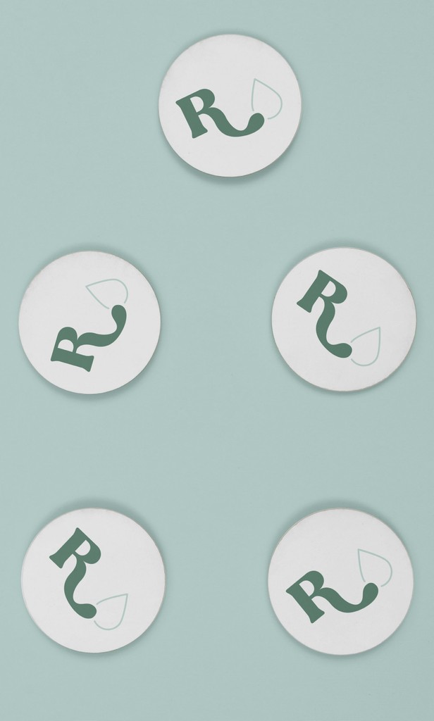
This was achieved by using a customisable typeface with optional glyphs, to maintain identifiability,
with a splash of playfulness 💧
To gain a visual identity of trustworthiness, the client wanted to explore the avenue of simplicity. However, a visual balance had to be established due to the target audience being 11-16, and simplifying elements too much may come across as bland or clinical. Therefore, I explored ways to maintain trustworthiness alongside visually attracting the target audience.
This was achieved by using a customisable typeface with optional glyphs, to maintain identifiability, with a splash of playfulness 💧
To gain a visual identity of trustworthiness, the client wanted to explore the avenue of simplicity. However, a visual balance had to be established due to the target audience being 11-16, and simplifying elements too much may come across as bland or clinical. Therefore, I explored ways to maintain trustworthiness alongside visually attracting the target audience.
This was achieved by using a customisable typeface with optional glyphs, to maintain identifiability, with added playfulness 💧